Google Fonts is one of the first places web designers turn to for a website’s typography. Most websites looked nearly identical in their content formatting, before Google Fonts. As of March 2018, there are over 850 fonts in the library. Chances are you’ll find the right style to match your brand.
The best things about Google Fonts are:
It’s completely free
It’s fast
It’s easy
It’s organized
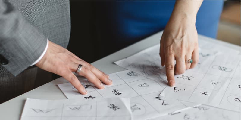
What about Google fonts pairings?
With the right choice of font pairings, your website can exude professionalism, beauty, and reader-friendliness without the need for expensive customized fonts.
Which are the top 10 Trending Google Font pairings of 2019?
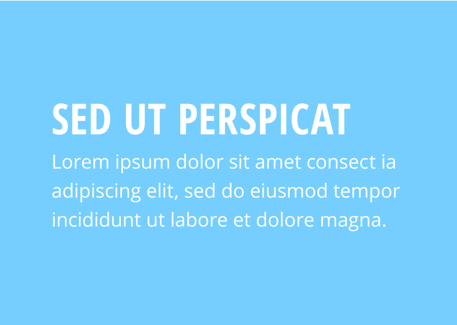
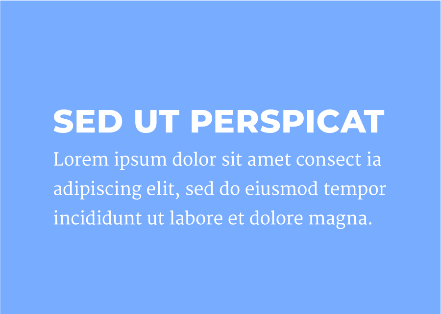
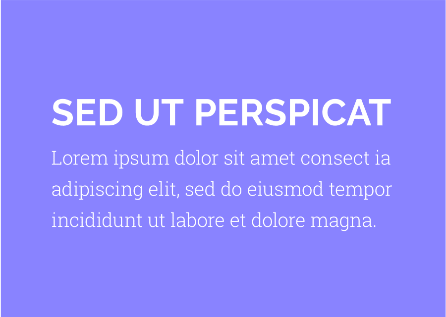
1. Open Sans Condensed + Open Sans
This is an easy combination, perfect for nearly any online use. Open Sans is one of the most versatile fonts in the whole Google Fonts library. It’s extremely easy to read in large blocks of text, while also bold enough for headlines.
This combination will serve any business, blog, landing page, or web app perfectly.
2. Oswald + EB Garamond
Oswald is a great font for headlines no matter the font-weight or use of caps. It naturally pops, but it also makes for a pleasantly unique text as your main body’s font.
This selection is the go-to choice for high-end clients, such as lawyers, estate agencies, or even designer outfitters.
3. Montserrat + Merriweather
Montserrat is a favorite font of designers because of it’s so versatile and easy to use and paired with Merriweather, they both work great as headlines or paragraph text.
This particular combination is a nice balance of the modern and classic design. These fonts are great for any type of online news source or publishing agency.
4. Roboto Thin + Roboto Regular
The Roboto font-family is another favorite. It’s extremely versatile, with a wide range of font weights, with practically no limitation to what the font could be used for. Modern and geometric as well as friendly and dependable, Roboto is great for any project, particularly great for new tech businesses, modern small start-up companies, or any type of brand with an eye to the future.
5. Raleway + Roboto Slab
It’s a font that is just as versatile as its cousin above, thought a bit more classical in style. When paired with the distinctive and bold Raleway, you will get clean and refined typography.
Super sophisticated, if used as an all-caps headline, it works very well for luxury products like jewelry, designer clothing, etc.
6. Playfair Display + Source Sans Pro
Playfair Display’s designers were apparently inspired by the letter-forms of the 18th century, which is why this font certainly carries an old-world charm but with a modern edge.
Source Sans Pro propels you into the future, by creating a striking modern impact while remaining useful.
Playfair Display adds a personal touch to something like a tagline or product description, whilst Source Sans Pro keeps the text grounded in a modern and clean presentation.
7. Fjalla One + Noto Sans
Fjalla One may not be the most versatile of fonts, but it’s great for creating headlines that demand attention. Small or large, lowercase or caps, those letters are hypnotic no matter what you do with them.
People across the world can use this font in various languages without formatting errors, which makes this font great for blogs or landing pages, or anything with long text that requires several sub-headings to section text content. Noto Sans is extremely adaptable, making it a good choice where a company is seeking to reach a universal audience.
8. Alegreya + Lato
Alegreya has a friendly and open feel. There’s no pretense about its personality; what you see is what you get.
Lato is a close second to Open Sans as an all-purpose, easy on the eye font in Google’s library. Alegreya & Lato together make for a combination that is fun, easy to read, and pragmatic.
9. PT Sans Narrow + PT Sans
Another modern take on an old-world style, PT Sans and PT Sans Narrow make a definitive statement when used together.
This pairing is very suitable to use for tech start-ups, software applications, or other digital businesses.
10. Amatic SC + Josefin Sans
This combination isn’t everyone’s cup of tea, but the playful nature of both Amatic SC and Josefin Sans definitely make a standout statement, which can work as long as it is used with caution.
Great for artists, musicians or entertainers, this font could be essential in capturing your unique personality. This combination could work well for a niche blog as well, depending on the tone, but perhaps not so much for long block text.
Get Expert Advice
Google fonts pairings can really make a difference in the look and feel of your website or blog. For impartial advice and tailor-made guidance on using Google fonts and empowering your online presence, contact us today!